Best Web Design Tips to Build Authority and Stand Out Online
Starting a web design project often means staring at a blank page—and that can feel overwhelming. So, where do you begin?
The best place to start is with your content. Once your message and structure are clear, design becomes a tool to present that message effectively. A well-designed site should look visually appealing, guide visitors intuitively, and inspire them to take action.
Here are proven web design strategies to help you create a site that looks polished, feels purposeful, and builds your credibility—whether you're working solo or with a designer.
Start with a Clear User Journey
The most effective websites are built with intention. Before choosing colors or adding images, get clear on what action you want your visitors to take. Do you want them to buy something? Sign up? Contact you?
Sketch a user journey or wireframe that highlights:
- Key messages
- Calls to action
- Navigation flow
A strong plan saves time and keeps your design focused on what matters most.
Design for Authority and Differentiation
To stand out in your niche, your website should blend credibility with originality:
- Use a consistent visual language (fonts, colors, icons) that aligns with your brand
- Show social proof: testimonials, media features, certifications
- Include expert signals: author bios, original imagery, research-backed content
- Incorporate unique visual elements like signature colors, custom dividers, or branded backgrounds
These small details build trust and help your site look both professional and personal.
Keep Visuals Clean and Strategic
Images: Use high-quality, relevant visuals. Avoid blurry or overly generic stock photos. When custom photos aren't available, use reputable sources like Unsplash, DepositPhotos, or Shutterstock. Compress files and use .jpgs for faster load times.
Graphics: Enhance understanding with icons, diagrams, and charts. Add branded design accents—like lines, textures, or color overlays—to reinforce your visual identity.
Choose Colors That Speak to Your Audience
Stick to a simple palette: one dominant color and one or two accent colors. Color impacts emotion and user behavior:
- Blue = Trust, calm
- Red = Action, urgency
- Green = Growth, eco-conscious
- Purple = Creativity, luxury
Ensure contrast for readability and adhere to accessibility standards.
Pick Readable, Versatile Fonts
Choose fonts that are clear and consistent across all devices. Google Fonts offers free web-safe options with multiple weights (regular, bold, italic). Stick to one or two font families to avoid visual clutter.
Guide Visitors with Content + Layout
Use structure to make content scannable:
- Headings and subheadings
- Bullet points
- Bold text for emphasis
Create visual hierarchy:
- Larger fonts for main headlines
- Smaller fonts for supporting text
- Spacing between sections for natural flow
Use White Space to Improve Readability
White space gives your content breathing room. Don’t crowd elements—let the design flow naturally, even if it means more scrolling. A clean layout helps visitors stay engaged.
Prioritize What’s “Above the Fold”
Make the top of your page count. Highlight your most important offer, message, or call to action early—without overwhelming the space. Examples:
- Lead magnet
- Product launch
- Core value proposition
Position supporting content like testimonials and blog posts further down.
Design Mobile-First
With over 60% of traffic coming from mobile, your site must look great on small screens before desktops.
Mobile-first tips:
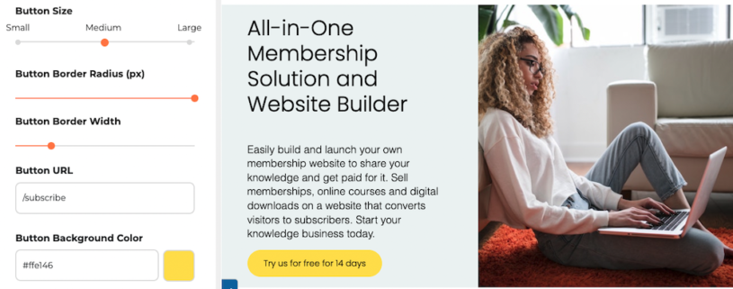
- Use large, tappable buttons
- Keep paragraphs short
- Stack content vertically
- Avoid small fonts or cluttered menus
Speed and Performance Matter
Page speed affects SEO and conversions. Optimize with:
- Google PageSpeed Insights or GTMetrix
- Caching/CDNs (e.g., Cloudflare, WP Rocket)
- Image compression
- Minimal animations and lightweight code
Stat: A 1-second delay in page load time can lower conversions by 7% (Portent, 2023)
Use Microcopy to Build Trust
Microcopy includes helpful bits of text like button labels, error messages, and form instructions. Done well, it improves usability and adds personality.
Examples:
- “Start My Free Trial” instead of “Submit”
- “Oops! This page wandered off…” on a 404 page
Microcopy is a small but powerful way to reinforce your brand voice.
Make Your Site Accessible
Designing for accessibility improves UX and can enhance SEO. Key principles:
- Use high-contrast colors
- Add alt text to all images
- Avoid autoplay video and flashing content
Keep in mind:
- Ensure your alt text describes what is happening in the picture (avoid keyword-only alt tags)
- Accessible browsers and screen readers can't "see" video and animations
Consider Hiring a Web Design Expert
DIY tools are helpful—but if you feel stuck or want professional polish, a designer can make a huge difference. They bring an expert eye for layout, branding, and UX best practices.
Need help? SubHub’s Design Service builds professional, conversion-focused websites in just 4–6 weeks. Stress-free and results-driven.
Final Thoughts: Design with Purpose
Effective web design isn’t just about trendy fonts or flashy graphics—it’s about clarity, connection, and credibility.
Remember:
- Start with content and goals
- Build a user-friendly, mobile-first layout
- Use design to support trust, authority, and action
A purposeful website builds your brand, nurtures your audience, and fuels long-term growth.
Ready to create a website that looks great and builds authority? Contact SubHub today for a free consultation.


