Converting visitors to members
Creating a membership website homepage is more than just designing a visually appealing page; it’s about crafting an experience that guides visitors seamlessly toward becoming subscribers. Membership homepages need content designed to introduce, inform, build trust, peak interest and prompt the subscription of a visitor. And they also need to be optimised with keywords to be found by search engines.
We've created a checklist of homepage elements and best practices to use when building your membership website.
Key elements of a high-converting membership homepage
1. A simple logo
The first element most people add to their website is a logo. Your logo should reflect your brand identity without dominating the page. Oversized logos can waste valuable space and push important content below the fold. Unless you’re a household name, your logo alone won’t drive conversions—so keep it subtle.
2. Add a favicon
That small icon in your browser tab, known as a favicon, is an often-overlooked detail. It enhances your brand’s visibility when users have multiple tabs open. Including one reinforces professionalism and helps visitors easily locate your site.
When building your homepage, make sure you pay attention to even the smallest detail.
3. Streamlined navigation links
A clutter-free header is crucial for usability. Stick to six or fewer navigation links to maintain a clean and intuitive structure. Essential links like Home, Subscribe, or Services should be prominent, while secondary ones like About or Contact can be placed in the footer.
Take some time to plan how your members will navigate your content. Make sure your site's navigation is logical and user friendly. Good structure is important for both users and search engines when they are crawling your site to index it.
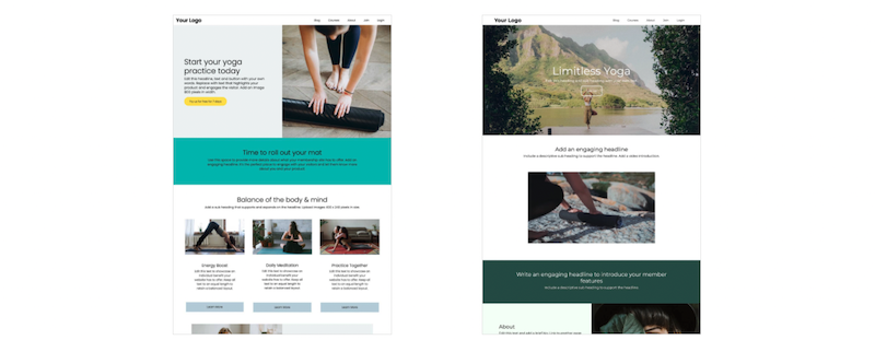
4. Create an impactful banner
Your banner is the first point of engagement for a visitor as it’s ‘above the fold’. This means it’s the content that first fills the screen. Here’s where you need to make an impact and capture a visitor’s interest.
Use a high-quality, appealing image. Make sure you’ve compressed the file so it loads quickly, saves bandwidth and doesn’t ‘dribble’ down the screen. Use online image compression tools like tinyjpg and tinypng.
Your banner headline needs to connect with and inspire your audience AND be compelling enough to convince a visitor to keep scrolling. Exercise “power words” to motivate your audience to convert.
Use the supportive subheadline, to add clarity and emphasise your value proposition or unique selling point.
Anchor the text with a call to action button to trigger further action. Link it to your subscribe, store or learn more page.
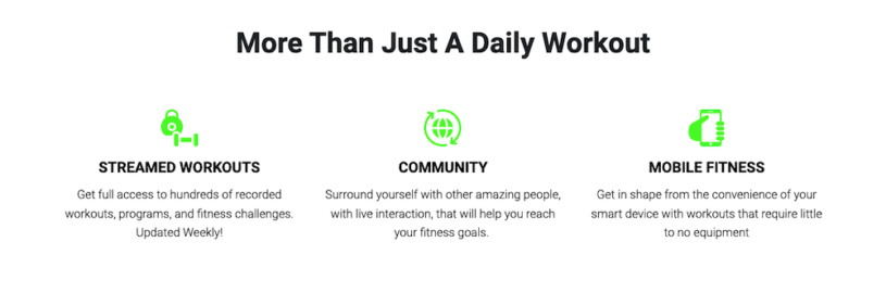
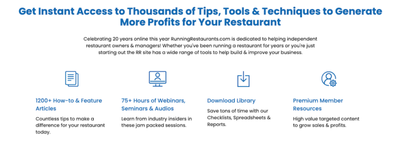
5. Showcase member benefits
Dedicate a section to highlight 3–4 key benefits of becoming a member. Use concise, descriptive text and relevant keywords for better SEO. Enhance readability by pairing benefits with icons to draw attention and make your message visually engaging.
6. Tell your story
A well-written “About” section can humanise your brand. Share your mission, values and the inspiration behind your service. This is your opportunity to connect with visitors emotionally, fostering trust and encouraging them to explore further.
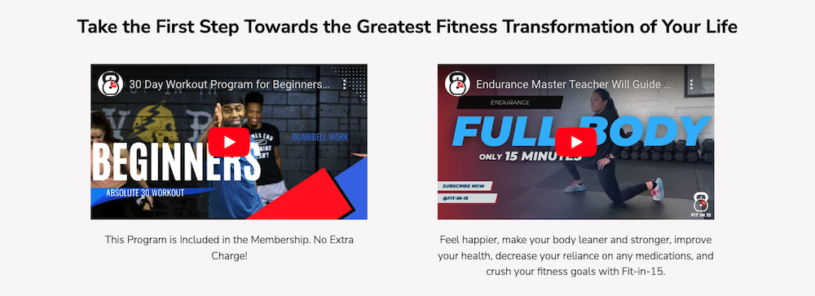
7. Highlight results with before & after visuals
For industries like fitness or design, before-and-after images are powerful tools to establish credibility. Real-life examples showcase tangible benefits, encouraging potential members to envision their own success.
8. Build trust with testimonials
Incorporate 2–4 authentic testimonials to validate your service. Member endorsements are a proven way to boost credibility and reduce hesitation. A homepage with social proof is far more likely to convert.
9. Offer free samples
Give visitors a sneak peek at what’s behind the paywall. This could include free tutorials, downloadable resources, or access to a limited section of your content. Not only does this build trust, but it also improves your site’s SEO by offering publicly indexable content.
Having a mix of member and non-member content is essential as Google doesn’t index content behind paywalls.
10. Optimise for SEO
On your homepage and throughout your membership website, you should be optimising your content to get found by search engines (SEO). This means incorporating the keywords and phrases that are being used when people are searching for content like yours.
Keywords help search bots understand your website and identify if it's relevant to a search query.
There are many research tools available to help you find relevant and trending keywords.
Keywords should be present in titles, headlines, body text, image tags and most importantly meta tags. Of course, this doesn't mean to keyword stuff. But to use keywords in a natural and authentic manner meant to inform and accurately describe your content and website.
11. Fast load times matter
Visitors won’t stick around if your site is slow. Large images are often the culprit, so compress files to reduce load time. Make sure to resize and compress large image files so they load fast and deliver a positive impression to visitors.
12. Capture leads with a newsletter
A pop-up or signup form for a monthly newsletter lets you stay connected with potential members who aren’t ready to subscribe immediately. Use newsletters to share updates, free resources, and exclusive deals, nurturing these leads over time.
13. Transparent pricing plans
Make it easy for visitors to see the value you offer. Display your subscription options near the bottom of the homepage, and include a CTA linking to the signup page. A clear pricing breakdown builds trust and aids decision-making.
14. Prioritise clean design
A simple, uncluttered layout ensures visitors focus on the key elements of your site. Incorporate white space strategically to improve readability and highlight important sections. Additionally, choose colors wisely to evoke the desired emotions and complement your branding.
Final thoughts
This improved version streamlines the content, makes it more engaging, and provides actionable advice with a clear and professional tone.