The most successful membership websites aren’t defined by their visual beauty but by their ability to deliver a positive user experience. This means a design that foremost focuses on meeting the needs of the user.
One of the guiding principles of UX (user experience) design is Hick’s Law.
In 1952, two psychologists, William Edmund Hick and Ray Hyman studied the relationship between stimuli and reaction time. They concluded that the more stimuli presented to a user resulted in a prolonged decision making process.
So the takeaway is that by reducing the number of stimuli, the user can more easily absorb information and make decisions faster.
In web design, the application of Hick’s Law is to create a design experience that removes obstacles and creates an environment of intuitive interaction. This is achieved by incorporating the four principles of readability, clarity, conformity and hierarchy.
1. Deliver Readability
Understanding how users interact with web pages is essential. Websites are NOT read but scanned. Users scan web pages for content that interests them.
So introduce your content with descriptive headings in a larger font size to attract a visitor’s attention.
Massive blocks of information don’t communicate effectively because they are difficult to process. Instead, present your information in bite-sized chunks that can be quickly absorbed. Then provide links to pages where the visitor can explore the subject in more depth, if they choose.
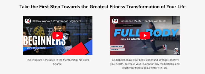
Incorporating infographics, icons and other visuals markers also help users intuitively consume information and guide them along the page.
2. Provide Clarity
It’s important to minimize choices on your homepage. You want to present enough information to trigger an action without the visitor getting distracted by information overload.
Take some time to map out a strategy that presents your membership website’s information in an easily accessible manner. One that respects the user's time and comfort for processing information.
Determine the purpose of your homepage and then focus on delivering that message. For example, do you want visitors to sign up to your mailing list or subscribe to your product? Make the primary option you want a visitor to focus on, be the most prominent.
Complex navigation menus are likely to lower pages views by presenting too many options to the visitor at once. Break down processes into manageable steps that don’t overwhelm the visitor.
At the same time, remember to balance delivering information that doesn’t require too many clicks to obtain it or you’ll risk a user getting frustrated and abandoning the site - no more than three clicks is the ideal.
3. Apply Conformity
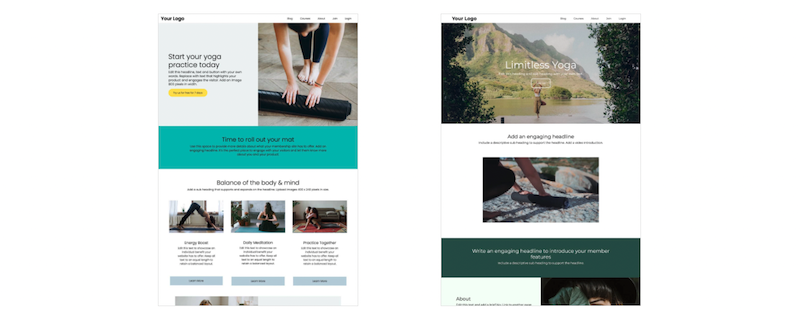
By using familiar design elements, you remove the need for users to interpret what is expected of them. Universally understood elements, such as the hamburger menu, provide an intuitive and streamlined user experience.
Sticking with standard patterns, like placing the login button in the top right hand corner, prevents frustration and allows the visitor to concentrate on the objectives of your website.
By being consistent in your design scheme, you facilitate your visitor’s decision-making process by removing unnecessary choices.
4. Map Hierarchy
Two types of hierarchy in website design are ‘primary’ and ‘visual’.
Primary hierarchy concerns how the website’s content is structured into categories using primary and secondary menus.
This provides a directional funnel where a user can seamlessly navigate your content and find what interests them. Messy navigation can cause visitors to lose their bearings and waste time having to reorient themselves.
Organised navigation also allows search engines to effectively and efficiently crawl and index your content. A site that is ordered into logical categories and subcategories creates a better site structure that is optimised for organic search.
Visual hierarchy aids visitors in negotiating your web pages. This is achieved by emphasising the content you want your visitor to focus on through size, color and placement.
Visitors see before they read so draw attention to important text with an icon or well placed image.
Distinguish significant text with larger headings that use a heavier (ie. bold) font weight. Use bright colors on links and buttons to make them more noticeable. Break down content into manageable sections that are easily consumed.
Conclusion
When designing your membership website, concentrate on bringing simplicity and clarity to every page. Make sure that each element you include serves a purpose tailored to meet the needs and comfort of your users so that their experience is a positive one.
In this age of information overload, less is often more.
You can test out these principles on your own membership website with your free SubHub 14-day trial.