
White space is a powerful design element that has an important role to play on your website.
The effective use of white space brings clarity to your design. It improves both the user experience and your marketing objective by directing a visitor’s attention to certain areas of your page - like a subscribe button or sign-up form.
As you add content to your site, you should always remain mindful of the space that surrounds each element. Elements that are too close together project a noisy and cluttered visual experience. By incorporating white space, you bring balance, comfort and focus to your design.
What is white space?
White space is the empty space around the content and its functional elements on your page. The fundamental role of white space is to let your design breathe by framing the content. The effect of white space brings clarity, organization and a visual hierarchy to the content on your page.
White space, also referred to as ‘negative space’, doesn’t only have to be empty, white space. Any type of space that serves as a background is described as white space. For example, a gradient background is also considered white space because it delivers the same result which is to create a visual buffer around content.
What are the benefits of white space?
1. White space makes your text more readable:
The correct amount of white space between letters, words and lines can improve the comprehension of your content by a user.
2. White space can focus a visitor’s attention:
White space around content or call-to-actions increases the attention those elements will receive from users. With the prudent use of white space, you can direct a visitor’s attention to specific elements - like a call-to-action button.
3. White space creates visual hierarchy:
Visual hierarchy is the order in which a visitor processes information on a page. The proper use of hierarchy organizes and ranks the content according to its importance and directs user attention toward specific CTAs.
It’s important to remember that users scan web pages rather than read them. By incorporating white space, you improve the scannability of a web page because that space helps to differentiate blocks of content and acts as a visual cue when a new concept is being presented.
How to include white space in your homepage design
Within the SubHub homepage editor, there are a number of ways for you to incorporate and control white space on your public and member homepages.
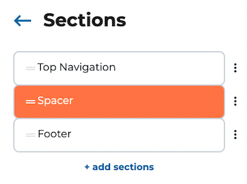
Add a Spacer section
Spacer sections are important to include between content sections on your homepages. After adding the spacer, click on it to adjust its height with the range slider. Add enough space to convey a visual separation between content sections.
Adjust the Section Width
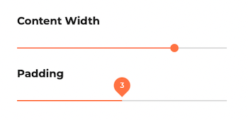
The section width’s range slider controls the width of a section’s container. By adjusting this setting, you can increase the side margin space.

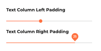
Add Column Padding
In the text and image sections, the column padding allows you to adjust the left and right text margins. Adding space around text, improves a user’s ability to comprehend it.
Increase the Content Padding
The content padding setting allows you to control the space around a body of text. Use this setting so the text doesn’t span the width of the page. Adding content padding will condense the text body and heighten its readability.
How to judge the correct amount of space
If you’re unsure where and how much space to add, ask yourself these questions:
- Is it obvious where a visitor should focus their attention?
- Does the space appear too empty?
- Does the page feel cluttered and dense?
- Can I easily scan the page and understand its content?
White space is integral to good design
Applied properly, white space creates balance, improves comprehension and delivers a positive visual environment for the visitor.
Open a free 14-day SubHub trial and experience the power of white space in your website design.


