Your membership website’s homepage should always be a work in progress. A homepage can easily begin to look outdated in the ever changing digital landscape so never consider it a finished product but always in a state of evolution.
You should regularly review its content, layout, navigation, page speed and SEO strategy. Look for ways to improve it based on visitor engagement, sales and the analytical data you gather.
SubHub’s homepage editor makes it easy to refresh your design whether it’s just a minor tweak or a major overall. So there’s no excuse not to take action to improve your membership homepage.
Reason to update your homepage
One important measure of engagement is your website’s bounce rate. Your bounce rate is the percentage of visitors that leave without taking any action - like clicking on a link or submitting a form. If the bounce rate is high, then there’s obviously room for improvement to be made.
1. Review homepage content
Ask friends and colleagues to evaluate your homepage to see if the communication about your product is coherent and persuasive.
Check that your headings and subheadings are effectively targeting the correct keywords and supporting your current SEO strategy. Your headings should be descriptive and draw the visitor in.
Remove any outdated material and fix broken links.
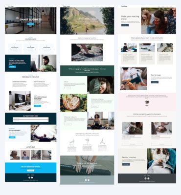
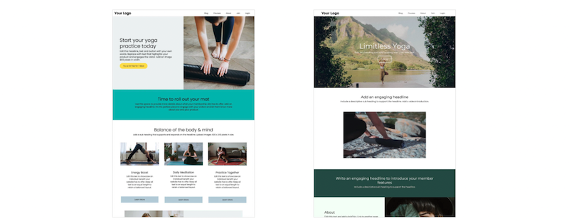
2. Check the visual layout
The current design trend is for an uncluttered layout that purposely uses white space to intentionally focus the visitor’s attention on key elements.
Make sure all the visual elements are complementary with each other in color and style. You want to present a unified design that is appealing, cohesive and supports your written copy.
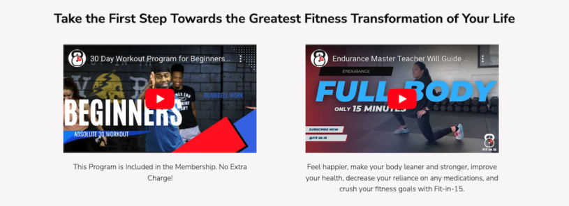
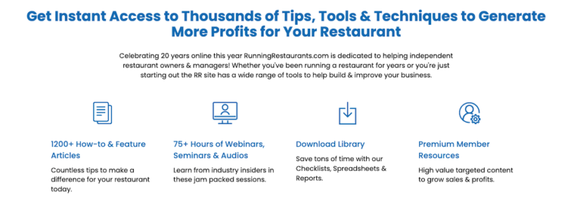
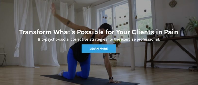
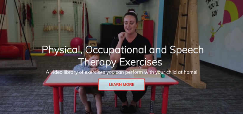
Replace blurry images with high quality visuals. Visitors to a web page ‘see before they read’ so take the opportunity to capture their attention right away with inspiring images. There are many sites where you can download free use images.
Look for inspiration from your competitor’s websites. Compare how they organize their content, use space and communicate with fonts.
Your design objective should be to create a smooth and fluid browsing experience for the user.
3. Incorporate white space to your advantage
White space brings visual balance and improves the user experience by framing elements.
The effective use of white space around and between text can improve comprehension by directing a visitor's attention to specific content.
Though not white, gradient backgrounds are also defined as white space. Gradient backgrounds are used to divide content into sections by providing the visual cue that a new concept is being introduced.
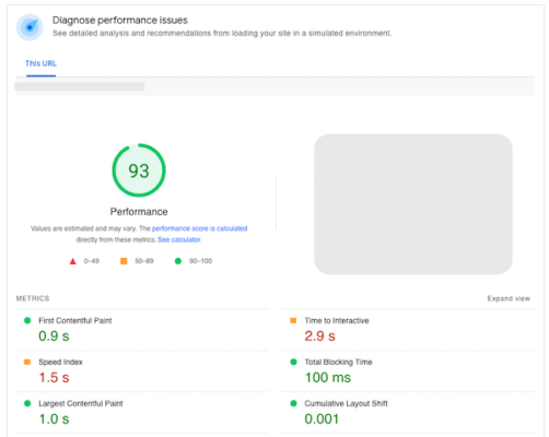
4. Check your page speed
Page speed is the time it takes your page to display content - a slow loading page has a ‘dribble’ effect. Slow loading pages can negatively affect your user experience. The longer a user needs to wait, the more likely they will abandon the page.
Large images and videos are the typical culprits for slow page speed. Always check the sizes and use editing tools to optimise and compress large image and video files.
Measure your page speed with Google PageSpeed Insights. You just need to submit your URL and Google will deliver a report on your site’s performance.
5. Review your SEO strategy
Your website will show up in search results based on the keywords and phrases that you use on your homepage and throughout your website. Keywords are the terms that users type into search engines when looking for a product like yours. Make sure that you are targeting the correct keywords for your audience by using keyword research tools.
Using the correct keywords and phrases will ensure that you show up in the relevant search results for your product.
Open a free 14 trial and start designing your SubHub membership website today.