Optimising your website's design for mobile devices is a must. With 70% of web traffic coming from mobile devices, you need to make sure that your website delivers a great user experience regardless of the screen size. To do this, your website needs to be responsive to the screen size it's being viewed on. When building your site, you should always be checking how it looks on various mobile devices and tablets.
Your website should be designed with a mobile-first mindset so it scales across different screen sizes. This means being strategic in deciding what content to include and how to present it. Some tips are to take advantage of collapsible tabs and menus, utilise white space and use carousels instead of vertical scrolling.
Fortunately, there's a browser tool that makes checking your website's responsiveness a no-brainer. By using the Device Mode in Chrome Developer Tools, you can quickly and easily simulate how a web page will look and perform across a range of devices.
What is Chrome Developer Tools?
Chrome DevTools is a suite of built-in tools created for the use of web developers but the Device Mode view is one feature that anyone can take advantage of. This easy-to-use tool resides right in your Chrome browser and can be opened on any web page. It contains a drop down menu with a selection of devices and lets you simulate how your page will appear when viewed on that mobile device or tablet.
How to Open Chrome DevTools
In your Chrome browser, go to the page you wish to examine. Right click in the page and select 'Inspect' from the screen menu. Or click the three vertical dots on the right hand side of the browser bar then select 'More Tools' and 'Developer Tools'. You can also use the keyboard shortcuts:
- CMD + Shift + C for Macs
- Control + Shift + C for Windows
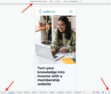
Click Toggle the Device toolbar to open the UI that lets you simulate a mobile viewport. To simulate the screen view of a specific device, click the Dimensions label and select the device from the menu.
Exit the DevTools by clicking the 'X' icon in the upper right hand side of the bottom window.
Why mobile-first design is important to SEO
Mobile optimisation is central to a website's performance. Because smart phone users accessing the internet will only continue to grow, Google has updated its algorithm. In 2018, Google announced it would implement mobile-first indexing. This means that Google will primarily use the mobile version of a website's content to rank its pages. And pages that adhere to mobile-first best practices will rank higher.
So be sure to check that your website delivers a fast, responsive and navigable experience to its visitors whether they are on desktop or mobile.