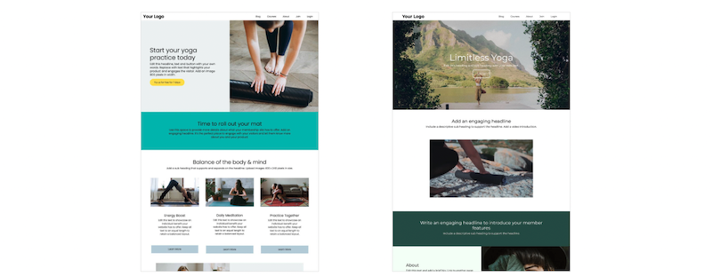
Your homepage is the first impression any prospective member has of your business.
Getting it right can be the difference between gaining or losing business. Here are some top pointers to ensure that your homepage presents the best possible image to those who visit.
1. Who’s it for?
Knowing your audience guides the design, copy and direction of your homepage. Draw yourself up a set of customer personas; your three ideal customers. Think about age, sex, interests, the types of magazines and websites they read, their web usage: build up a full picture of who you’re expecting to visit and create something that will appeal to this group.
2. Mission Statement
Getting your mission statement in place should be one of the first things you do when you start your business. A mission statement tells people what really matters to your business or organisation - it’s a brief snapshot of what you’re all about. Use this mission statement to guide not just the contents of your homepage, but its design too.
3. Design on Paper First
If you go straight into creating what you think is right for your organisation, you may well stumble across problems. Use good old fashioned pen and paper to sketch out your ideas of how the new website should look: not only will this help you to get a handle on the design element, but it will make you think about exactly what information, photos and other details you’ll need to include.
4. Font Choice
Choose a font that matches the brand personality you are trying to present. Sans fonts can be playful and fun while serif fonts are more serious in style and suggests credibility and trustworthiness.
5. Color Scheme
The colors used for your membership website not only project your branding, but can also deliver messages and affect the mood of a visitor. Different colors should be chosen depending on what you’re looking to achieve. White symbolises truthfulness and purity, while black is a color that represents dignity and security, while blue represents trust and reassurance.
Ultimately, choose colors with your audience and brand in mind, and keep it simple.
6. Testimonials
There’s no denying the importance of testimonials when it comes to your website. Unless you’ve managed to find the perfect niche, you’ll be competing against a number of other organisations who are all doing the same thing as you: some better, some worse.
Add testimonials that position you in the best possible light, and demonstrate why people should choose you over your competitors. And put these comments front of house on the homepage for all to see.
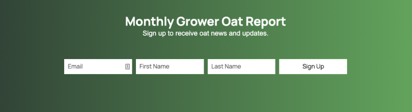
7. Call to Action
Before you start building your membership website, think about exactly what you want to achieve from the site. If the call to action is to get visitors to sign up for membership, for example, then make sure that they are able to do so easily. Make sure you give them the reasons why they should sign up, so that they know what it involves. Your call to action could be to get them to sign up to your newsletter, or to make a purchase: whatever it is, you need to be sure to make it easy for visitors to achieve their goal.
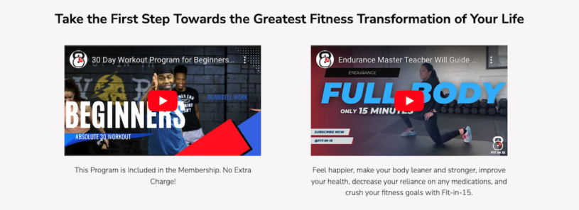
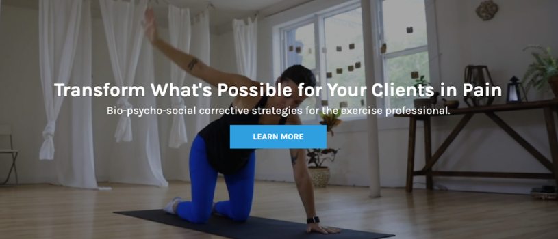
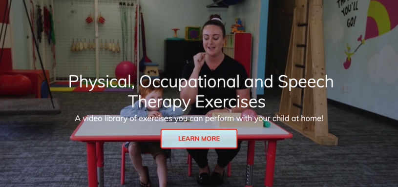
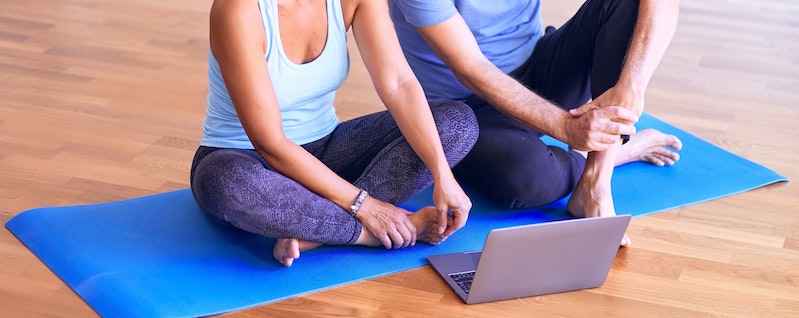
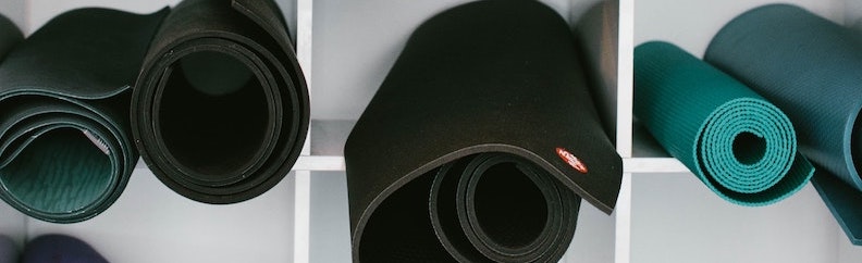
8. Images
If you want a professional-looking membership website, you need professional-looking images to match. It’s now easier than ever to take photos on the go using smartphones and tablets, but a grainy phone photo just won’t cut the mustard. Photos don’t need to be professionally taken and edited on an expensive piece of kit, just bear in mind that the pictures you use are yet another way in which website visitors will assess your brand.
9. Proofread
Some of those who visit your website may never have met you before, nor had any contact with your organisation. In situations like this, it really is true that first impressions count. If your site’s littered with spelling or grammatical mistakes, website visitors may end up believing that your English is poor, or that you simply don’t care about the details - not a great first impression to make.
10 Check the Links
Once your membership website homepage is live you need to check every link to make sure it heads to the right place: if these links fail when clicked, you won’t be making a great impression on visitors. Inbound and outbound links are also important to improve your SEO.
While it may seem like there’s a lot to do to create the perfect homepage for your members, it’ll all be worth it in the end. After all, would you rather have a speedy website that turns visitors off, or a more polished version that increases membership? The choice is yours...