Your website is often the first impression visitors have of your brand, making it essential to deliver a user-centric experience. A website that is well-designed, intuitive and addresses the pain points of your target audience will increase engagement and build trust. Conversely, a site that fails to meet visitors' needs can lead to a negative perception and high bounce rates. Ensuring that your website addresses the needs of your audience is crucial for driving engagement, retaining visitors and being profitable.
In our experience of helping clients, we've noticed that many make the same mistakes when building their website. In this post, we'll explore six common mistakes to avoid when building your website.
What is user-centric?
"User-centric" refers to the design philosophy that prioritises the needs of the end-users. A user-centric website is designed with the primary goal of providing an intuitive and experience for visitors. This involves addressing their pain points and creating a seamless interaction that meets their needs effectively. User-centric design is essential for ensuring high levels of user engagement, satisfaction and loyalty.
1. Doesn't address pain points
Addressing user pain points on your website is essential for several reasons. Firstly, it demonstrates that you understand your audience and their needs. By identifying and addressing their frustrations or challenges, you can build trust and loyalty with your audience, fostering long-term relationships. When users encounter smooth, efficient solutions to their problems on your site, they are more likely to return and recommend your platform to others.
By removing obstacles in the user journey, you make it easier for visitors to complete desired actions, such as making a purchase or signing up for a service. Ultimately, prioritizing the resolution of user pain points not only enhances the overall user experience but also contributes to the success and growth of your website or business.
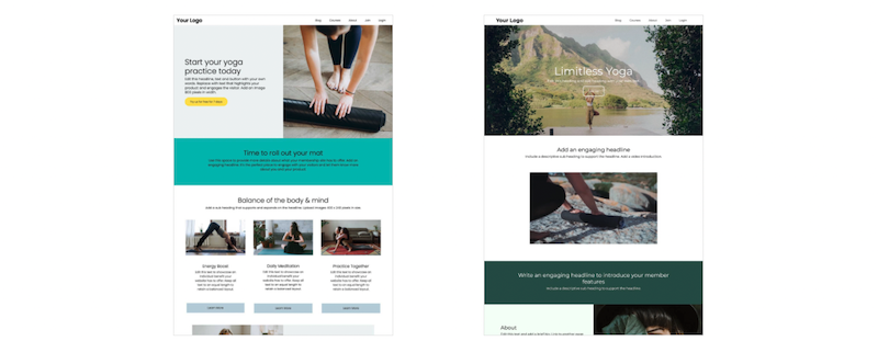
2. Poor navigation
One of the most critical aspects of a website is its navigation. Visitors should be able to find what they’re looking for quickly and easily. Complex menus, broken links and a lack of a clear structure can frustrate users and drive them away. Ensure your site has a logical, intuitive layout with clearly labeled sections and a search function.
Strategies to improve website navigation:
- Use a simple menu structure: A clear and concise menu with well-defined categories help users easily find what they are looking for.
- Write descriptive labels: Menu items and links should have descriptive labels that accurately represent the content they lead to.
- Add a search function: Include a search bar to allow users to quickly locate specific information or products.
- Optimize for mobile: Ensure that the navigation is mobile-friendly, with touch-friendly elements and easy-to-use menus for smaller screens.
3. Not mobile-friendly
With the increasing use of smartphones and tablets, having a mobile-friendly website is no longer optional. If your site isn’t optimized for mobile devices, you’re likely losing a significant portion of potential visitors. Make sure your design is responsive, meaning it adapts to different screen sizes and provides a seamless experience across all devices.
You can use Chrome Developer Tools to check your website on multiple screen sizes.
4. Slow load times
Users expect websites to load quickly. If your site takes too long to load, visitors may leave before it even finishes. Factors that can slow down your site include large images, excessive use of plugins, and poor server performance. Use tools like Google PageSpeed Insights to identify and fix issues affecting your site’s speed.
5. Lack of clear call-to-actions
A website should guide visitors towards taking specific actions, whether it’s signing up for a newsletter, making a purchase, or contacting you for more information. Without clear and compelling CTAs, visitors might not know what to do next, resulting in missed opportunities. Make sure your CTAs are prominent, concise and convey a sense of urgency.
5. Ignoring SEO
Search Engine Optimization (SEO) is crucial for driving organic traffic to your site. Ignoring SEO means your site may not appear in search engine results, making it difficult for potential visitors to find you. Focus on keyword research, use descriptive meta tags and create high-quality content that provides value to your audience. Regularly update your site to keep it relevant and search engine-friendly.
6. Using sliding banners or carousels
Using sliding banners, or carousels, on a website can often do more harm than good. While they may seem like an efficient way to display multiple messages or promotions, they can overwhelm visitors with too much information. Many users may not stay on a slide long enough to absorb its content and crucial messages can be easily missed as the slides automatically transition. Moreover, sliding banners can negatively impact page load times, which frustrates users and may lead to higher bounce rates. Studies have shown that the first slide receives the most attention, while subsequent slides often go unnoticed, rendering them ineffective. Static banners are more effective in conveying important information clearly and concisely.
Conclusion
Avoiding these common mistakes can significantly enhance your website’s performance and user experience. By ensuring easy navigation, optimising for mobile, speeding up load times, using effective CTAs, and prioritising SEO, you can create a successful and engaging website that attracts and retains visitors.